
Quick Answer
A marketing dashboard is a centralized visual interface that aggregates key performance metrics from multiple data sources into a single, real-time display. It gives marketing professionals and business owners a unified view of campaign performance, channel health, and revenue contribution without switching between platforms.
The standard industry term is "marketing analytics dashboard," though most practitioners simply call it a marketing dashboard. Tools like Google Analytics 4, HubSpot, Salesforce, and Facebook Ads each generate their own data. A dashboard pulls all of it together. The result is one screen that tells you whether your marketing is working, where it is breaking down, and what needs attention right now.
What is a marketing dashboard and what does it track?
A marketing dashboard is defined as a live reporting interface that consolidates data from platforms like Google Analytics, Facebook Ads, HubSpot, and Salesforce into a single actionable view for cross-channel attribution and unified reporting. That integration is what separates a dashboard from a spreadsheet. A spreadsheet holds data. A dashboard surfaces meaning.

The core components of any effective dashboard are data source connections, key performance indicators (KPIs), visual charts or graphs, and automated alerts. Data sources feed the dashboard continuously. KPIs define what success looks like. Visualizations make patterns visible at a glance. Alerts notify you when a metric crosses a threshold you set.
A functional marketing dashboard aggregates 10, 15 core KPIs from CRM systems, web analytics, paid ad networks, and email marketing tools to provide a unified funnel health view executives need for budget decisions. Fewer than 10 KPIs and you risk missing critical signals. More than 15 and the display becomes noise.
Common metrics found on marketing dashboards
- Website traffic and traffic sources
- Conversion rate by channel
- Customer acquisition cost (CAC)
- Return on ad spend (ROAS)
- Email open and click-through rates
- Social media engagement rate
- Marketing qualified leads (MQLs)
- Revenue attributed by channel
Pro Tip: Choose your KPIs based on your current business goal, not on what every dashboard template includes. A local service business tracking CAC and booked appointments needs a different setup than an e-commerce brand tracking ROAS and cart abandonment.
How do different types of marketing dashboards compare?
Three distinct dashboard types serve different decision-making needs. Choosing the wrong type for your audience creates confusion rather than clarity.
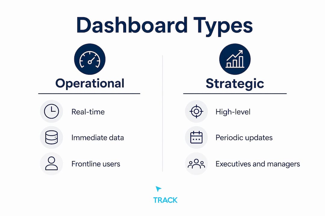
Operational dashboards monitor real-time activity. A paid media manager watching cost-per-click fluctuate during a live campaign uses an operational dashboard. It updates continuously and flags issues as they happen.
Strategic dashboards give executives a high-level view of performance against goals. They update daily or weekly and focus on trends rather than individual data points. A CMO reviewing monthly revenue attribution across channels uses this type.
Analytical dashboards support deep investigation. They let you slice data by segment, date range, or audience to uncover patterns. A marketing analyst diagnosing a drop in organic conversions uses an analytical dashboard to test hypotheses.
| Type | Primary Purpose | Update Frequency | Primary Audience |
|---|---|---|---|
| Operational | Real-time monitoring and alerts | Continuous or hourly | Campaign managers, media buyers |
| Strategic | High-level goal tracking | Daily or weekly | CMOs, business owners |
| Analytical | Deep data investigation | On demand | Analysts, strategists |
Selecting the right type matters because the same data presented to the wrong audience in the wrong format produces bad decisions. An executive looking at an operational dashboard sees noise. An analyst looking at a strategic dashboard sees too little detail to act.
What is the difference between a marketing dashboard and a report?
Dashboards provide forward-looking, real-time monitoring, while reports are static, backward-looking documents built for accountability and historical analysis. Both are necessary. Neither replaces the other.
A dashboard answers the question "What is happening right now?" A report answers "What happened last quarter and why?" The dashboard is always live. The report is a snapshot frozen at a point in time.
The practical difference shows up in how each is used. You check a dashboard before a budget meeting to see current performance. You send a report after a campaign ends to document results and justify spend. Dashboards drive immediate course corrections. Reports inform longer-term strategy.
| Feature | Dashboard | Report |
|---|---|---|
| Data timing | Real-time or near real-time | Historical snapshot |
| Format | Visual, interactive | Static document or PDF |
| Primary use | Monitoring and fast decisions | Analysis and accountability |
| Update frequency | Continuous or scheduled | Weekly, monthly, or quarterly |
| Audience | Operators and managers | Executives and stakeholders |
Overloading dashboards with raw data reduces their real-time value. The moment a dashboard starts looking like a report, it stops functioning as one. Keep them lean and visual.
How do you create and customize a marketing dashboard?
Building a dashboard that actually gets used requires a deliberate process. Most dashboards fail not because of bad data but because they were built without a clear question to answer.
Step 1: Define your primary goal. Are you monitoring a paid campaign, tracking monthly revenue attribution, or watching funnel conversion rates? The goal determines everything else.
Step 2: Choose your KPIs. Select 10, 15 metrics that directly reflect progress toward that goal. Resist the urge to add metrics because they are available.
Step 3: Connect your data sources. Tools like Zoho Analytics, Salesforce dashboards, and Google Looker Studio connect natively to GA4, HubSpot, Google Ads, and Facebook Ads. Native connectors reduce setup time and minimize data errors.
Step 4: Build your visualizations. Limit visualizations to 7, 9 per view and arrange them hierarchically with the most critical KPIs at the top. Relevant information should be accessible within 5 seconds. If a viewer has to hunt for the key number, the layout has failed.
Step 5: Set alerts and automate refresh. Alerts notify you when CAC spikes or conversion rate drops below a threshold. Automation keeps the data current without manual exports.
Step 6: Iterate based on use. A dashboard no one checks is a dashboard that needs to change. Review which panels your team actually uses and remove what they ignore.
Modern tools like Zoho Analytics and marketing automation platforms now include AI-assisted anomaly detection. These features flag unusual patterns automatically, so you do not have to monitor every metric manually.
Pro Tip: Build one dashboard per audience, not one dashboard for everyone. Your media buyer and your CFO need different views of the same data. Separate dashboards with shared underlying data sources solve this cleanly.
What are the real benefits of marketing dashboards?
“Dashboards serve as command centers transforming scattered data points into clear narratives that enable confident, data-driven marketing decisions rather than intuition-based guesses.”
That framing is accurate. The practical benefit is speed. When all your data lives in one place, you respond to problems in hours rather than days.
Centralizing data in marketing dashboards breaks down data silos and eliminates inefficient platform-switching, accelerating faster, evidence-based marketing responses. Platform-switching is a real cost. Every time a marketer logs into Google Ads, then HubSpot, then GA4 to piece together a picture, they spend time on assembly rather than analysis.
The concrete benefits include:
- Faster decisions. You see performance across all channels in one view, so problems surface immediately.
- Better budget allocation. When you can see revenue attributed by channel, you move budget toward what works and away from what does not.
- Team alignment. A shared dashboard gives every stakeholder the same version of the truth. Disagreements about performance become less common.
- Funnel visibility. You can monitor where leads drop off across the full marketing funnel and fix bottlenecks before they compound.
- Accountability. When metrics are visible to everyone, performance expectations become concrete rather than subjective.
Effective marketing dashboards increase marketing precision, visibility, and accountability, moving organizations beyond intuition to data-driven marketing operations. The shift from gut-feel to evidence is not just philosophical. It changes how budgets get approved and how campaigns get adjusted.
Key takeaways
A marketing dashboard is the single most direct tool for connecting marketing activity to business outcomes, but only when built around clear goals and the right metrics.
| Point | Details |
|---|---|
| Core definition | A marketing dashboard aggregates KPIs from CRM, web analytics, and ad platforms into one live view. |
| Metric discipline | Limit dashboards to 10, 15 KPIs to maintain clarity and avoid information overload. |
| Dashboard vs. report | Dashboards monitor what is happening now; reports document what happened and why. |
| Design best practice | Cap visualizations at 7, 9 per view and place the most critical metrics at the top. |
| Primary business value | Dashboards eliminate platform-switching and accelerate evidence-based marketing decisions. |
Why most marketing dashboards fail before they start
I have reviewed a lot of marketing dashboards built by smart teams, and the most common failure has nothing to do with the tool. It has to do with the question the dashboard was built to answer.
Most dashboards get built by pulling in every available metric from every connected platform. The result looks impressive in a demo. In practice, nobody uses it because nobody knows what they are supposed to do with it. A dashboard that shows 40 metrics answers no question clearly.
The second most common mistake is treating a dashboard like a report. Teams build a monthly summary view, call it a dashboard, and then wonder why it does not help them make faster decisions. A real dashboard is a monitoring tool. It tells you when something needs attention today, not what happened last month.
The third mistake is building one dashboard for everyone. Your paid media manager needs to see cost-per-click and conversion rate by ad set. Your business owner needs to see total revenue, CAC, and return on marketing investment. These are different screens. Trying to serve both audiences with one view produces a screen that serves neither well.
What actually works is starting with a single question, building the smallest dashboard that answers it clearly, and adding to it only when a real need emerges. The best dashboards I have seen are almost boring. They show five or six numbers, they update automatically, and everyone on the team checks them every morning because the numbers tell them exactly what to do next.
If you want to track marketing ROI accurately, start there. Build the revenue view first. Everything else is secondary.
How click track marketing builds dashboards that prove revenue
Click Track Marketing's PeopleLytics platform delivers a weekly reporting dashboard that ties marketing activity directly to revenue. It is not a collection of channel metrics. It is a revenue attribution system that shows you which efforts are producing customers and which are not.
If you are running paid media, SEO, or content and you cannot trace spend to closed revenue, you are operating blind. Click Track Marketing connects your data sources, surfaces real buying intent through BuyerSignals, and identifies anonymous visitors through PeoplePixel. The result is a clear picture of what your marketing actually earns. Explore the full-funnel AI marketing system to see how it works in practice.